Back to: MATHEMATICS SS1
Welcome to class!
In today’s class, we will be talking about the statistical graph. Enjoy the class!
Statistical Graph

There are different types of graphs in mathematics and statistics which are used to represent data in a pictorial form. Among the various types of charts or graphs, the most common and the most widely used ones are given and explained below.
Types of graphs and charts
The list of most common graph types are as follows:
- Statistical Graphs (bar graph, pie graph, line graph, etc.)
- Exponential Graphs
- Logarithmic Graphs
- Trigonometric Graphs
- Frequency Distribution Graph
All these graphs are used in various places to represent a certain set of data concisely. The details of each of these graphs (or charts) are explained below in detail which will not only help to know about these graphs better but will also help to choose the right kind of graph for a particular data set.
Statistical graphs
A statistical graph or chart is defined as the pictorial representation of statistical data in graphical form. The statistical graphs are used to represent a set of data to make it easier to understand and interpret statistical data. The different graphs that are commonly used in statistics are given below.
| Types of Graphs in Statistics | |
| Bar Graphs | Line graphs |
| Pie Graphs | Histogram |
Bar Graph:
The pictorial representation of a grouped data, in the form of vertical or horizontal rectangular bars, where the lengths of the bars are equivalent to the measure of data, are known as bar graphs or bar charts.
The bars drawn are of uniform width and the variable quantity is represented on one of the axes. Also, the measure of the variable is depicted on the other axes. The heights or the lengths of the bars denote the value of the variable and these graphs are also used to compare certain quantities. The frequency distribution tables can be easily represented using bar charts which simplify the calculations and understanding of data.
Types of bar charts
The bar graphs can be vertical or horizontal. The primary feature of any bar graph is its length or height. If the length of the bar graph is more, then the values are greater of any given data.
Bar graphs normally show categorical and numeric variables arranged in class intervals. They consist of an axis and a series of labelled horizontal or vertical bars. The bars represent frequencies of distinctive values of a variable or commonly the distinct values themselves. The number or values on the x-axis of a bar graph or the y-axis of a column graph are called the scale.
The types of bar charts are as follows:
- Vertical bar chart
- Horizontal bar chart
- Range bar chart
- Vertical bar graphs:
When the grouped data are represented vertically in a graph or chart with the help of bars, where the bars denote the measure of data, such graphs are called vertical bar graphs. The data is represented along the y-axis of the graph and the height of the bars shows the values.
- Horizontal bar graphs:
When the grouped data are represented horizontally in a chart with the help of bars, then such graphs are called horizontal bar graphs, where the bars shows the measure of data. The data is depicted here along the x-axis of the graph and the length of the bars denote the values.
Examples:
To understand the above types of bar graphs, consider the following examples:
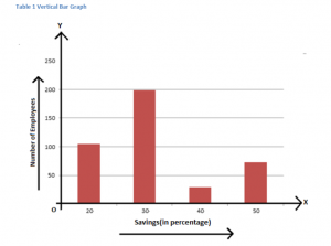
1. In a firm of 400 employees, the percentage of monthly salary saved by each employee is given in the following table. Represent it through a bar graph.
| Savings (in percentage) | Number of Employees(Frequency) |
| 20 | 105 |
| 30 | 199 |
| 40 | 29 |
| 50 | 73 |
| Total | 400 |
Solution
The given data can be represented as
What is a pie chart?
The “pie chart” also is known as “circle chart” divides the circular statistical graphic into sectors or slices to illustrate the numerical problems. Each sector denotes a proportionate part of the whole. To find out the composition of something, Pie-chart works the best at that time. In most of the cases, pie charts replace some other graphs like the bar graph, line plots, histograms etc.
Pie chart formula
The pie chart is an important type of data representation. It contains different segments and sectors in which each segment and sectors of a pie chart forms a certain portion of the total(percentage). The total of all the data is equal to 360°.
The total value of the pie is always 100%.
To work out with the percentage for a pie chart, follow the steps given below:
- Categorize the data
- Calculate the total
- Divide the categories
- Convert into percentages
- Finally, calculate the degrees
Therefore, the pie chart formula is given as
(Given Data/Total value of Data) × 360°
Pie chart example
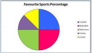
Imagine a teacher surveys her class based on their favourite Sports:
| Football | Hockey | Cricket | Basketball | Badminton |
| 10 | 5 | 5 | 10 | 10 |
The data above can be represented by a pie-chart as following and by using the circle graph formula, i.e. the pie chart formula given below. It makes the size of portion easy to understand.
Step 1:
First, Enter the data into the table.
| Football | Hockey | Cricket | Basketball | Badminton |
| 10 | 5 | 5 | 10 | 10 |
Step 2:
Add all the values in the table to get the total.
i.e Total students are 40 in this case.
Step 3:
Divide each value by the total and multiply by 100 to get a per cent:
| Football | Hockey | Cricket | Basketball | Badminton |
| (10/40) × 100
=25% |
(5/ 40) × 100
=12.5% |
(5/40) ×100
=12.5% |
(10/ 40) ×100
=25% |
(10/40)× 100
=25% |
Step 4:
Next, to know how many degrees for each “pie sector” we need, we will take a full circle of 360° and follow the calculations below:
The central angle of each component = (Value of each component/sum of values of all the components)✕360°
| Football | Hockey | Cricket | Basketball | Badminton |
| (10/ 40)× 360°
=90° |
(5 / 40) × 360° =45° |
(5/40) × 360°
=45° |
(10/ 40)× 360°
=90° |
(10/ 40) × 360°
=90° |
Now you can draw a pie chart.
Step 5:
Draw a circle and use the protractor to measure the degree of each sector.
Linear graph equation
As discussed, linear graph forms a straight line and denoted always as an equation;
y=mx+c
where m is the gradient of the graph and c is the y-intercept of the graph.
The gradient between any two points (x1, y1) and (x2, y2) are any two points on the linear or straight line.
The value of gradient m is the ratio of the difference of y-coordinates and the difference of x-coordinates.
i.e. m=y2-y1/x2-x1 Or y-y1= m (x – x1)
The linear equation can also be written as,
ax + by + c = 0
where a,b and c are constants
Linear graph examples
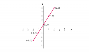
Let us understand the Linear graph definition with examples.
- The equation y=2x+1 is a linear equation or forms a straight line on the graph. When the value of x increases then ultimately the value of y also increases by twice of the value of x plus 1.
- Suppose, if we have to plot a graph of a linear equation y=2x+1.
Let us consider y=2x+1 forms a straight line. Now, first, we need to find the coordinates of x and y by constructing below the table;
| x | -2 | -1 | 0 | 1 | 2 |
| y |
Now calculating value of y with respect to x, by using given linear equation,
y=2x+1
y=2(-2)+1= -3 for x=-2
y=2(-1)+1= -1 for x=-1
y=2(0)+1= 1 for x=0
y=2(1)+1= 3 for x=1
y=2(2)+1= 5 forx=2
So the table can be re-written as;
| x | -2 | -1 | 0 | 1 | 2 |
| y | -3 | -1 | 1 | 3 | 5 |
Now based on these coordinates we can plot the graph as shown below.
What is a histogram?
A histogram is an area diagram. It can be defined as a set of rectangles with bases along with the intervals between class boundaries and with areas proportional to frequencies in the corresponding classes. In such representations, all the rectangles are adjacent since the base covers the intervals between class boundaries. The heights of rectangles are proportional to corresponding frequencies of similar classes and for different classes, the heights will be proportional to corresponding frequency densities.
In other words, a diagram involving rectangles whose area is proportional to the frequency of a variable and width is equal to the class interval.
How to make histogram?
You need to follow the below steps to construct a histogram.
- Begin by marking the class intervals on X-axis and Frequencies on Y-axis.
- The scales for both the axes have to be same.
- Class intervals need to be exclusive.
- Draw rectangles with bases as class intervals and corresponding frequencies as heights.
- A rectangle is built on each class interval since the class limits are marked on the horizontal axis, and the frequencies are indicated on the vertical axis.
- The height of each rectangle is proportional to the corresponding class frequency if the intervals are equal.
- The area of every individual rectangle is proportional to the corresponding class frequency if the intervals are unequal.
Although histograms seem similar to graphs, there is a slight difference between them. The histogram does not involve any gaps between the two successive bars.
Difference between histogram and bar graph
The difference between the histogram and the bar graph is given below:
| Histogram | Bar Graph |
| It is a two-dimensional figure | It is a one-dimensional figure |
| The frequency is shown by the area of each rectangle | The height shows the frequency, and the width has no significance. |
| It shows rectangles touching each other | It consists of rectangles separated from each other with equal spaces. |
Histogram types
Let us discuss the different types of histogram here. The following are the different types:
- Uniform histogram:
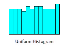
A uniform distribution reveals that the number of classes is too small, and each class has the same number of elements. It may involve distribution that has several peaks.
- Bimodal histogram:
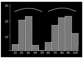
If a histogram has two peaks, it is said to be bimodal. Bimodality occurs when the data set has observations on two different kinds of individuals or combined groups if the centres of the two separate histograms are far enough to the variability in both the data sets.
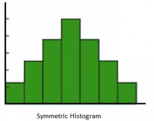
- Symmetric histogram:
We hope you enjoyed the class.
Should you have any further question, feel free to ask in the comment section below and trust us to respond as soon as possible.