Back to: MATHEMATICS JSS1
Welcome to class!
In today’s class, we will be talking about statistics. Enjoy the class!
STATISTICS
Purpose and usefulness of statistics Data collection, sources and importance Presentation and analysis of data frequency distribution Graphical presentation of data- the use of pictogram, bar chart, pie chart, and histogram
Statistics is a form of mathematical analysis that uses quantified models, representations and synopses for a given set of experimental data or real-life studies.
Uses of Statistics
- Statistics helps in providing a better understanding and exact description of a phenomenon of nature.
- Statistics helps in the proper and efficient planning of a statistical inquiry in any field of study.
- It helps in collecting appropriate quantitative data.
- Statistics helps in presenting complex data in a suitable tabular, diagrammatic and graphic form for easy and clear comprehension of the data.
- Statistics helps in understanding the nature and pattern of variability of a phenomenon through quantitative observations.
-
Pie Charts:
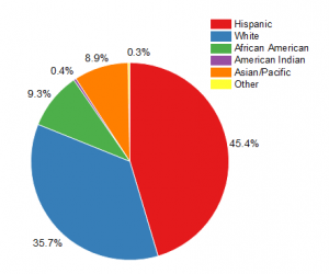
A pie chart or a pie graph is a circular representation of data. A pie chart not only represents frequency but also the numerical proportion. Each section of a pie chart is the proportionate quantity of the whole data. And the total value of a pie chart is always 100 (just as a percentage)
-
Bar Chart:
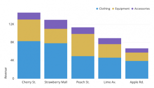
Also known as a column graph, a bar graph or a bar diagram is a pictorial representation of data. It is shown in the form of rectangle spaced out with equal spaces between them and having equal width. The equal width and equal space criteria are important characteristics of a bar graph.
-
Histogram:
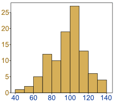
A bar diagram easy to understand but what is a histogram? Unlike a bar graph that depicts discrete data, histograms depict continuous data. The continuous data takes the form of class intervals. Thus, a histogram is a graphical representation of a frequency distribution with class intervals or attributes as the base and frequency as the height.
In our next class, we will be talking more about Statistics. We hope you enjoyed the class.
Should you have any further question, feel free to ask in the comment section below and trust us to respond as soon as possible.