Back to: Computer Science JSS 3
Welcome to class!
In today’s class, we shall be talking about the practical excel calculation and creating and editing graphs. Please enjoy the class!
Practical Excel Calculation – Creating and Editing Graphs
Excel’s capabilities go beyond simple number crunching. It’s also a data visualization powerhouse, allowing you to transform your calculations into impactful and informative graphs. This class will equip you with the skills to create and edit compelling graphs in Excel, turning your data into a captivating story.
Part 1: Selecting the Right Graph Type
Choosing the right graph type is crucial for effective data communication. Here’s a quick guide to some common charts and their strengths:
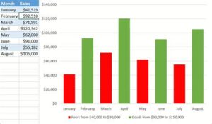
Column Charts: Ideal for comparing values across different categories.
Line Charts: Perfect for showing trends and changes over time.
Pie Charts: Effective for highlighting proportions and contributions within a whole.
Bar Charts: Similar to column charts, but with horizontal bars, useful for emphasizing specific categories.
Scatter Plots: Reveal relationships between two variables, ideal for identifying correlations.
Part 2: Creating the Graph
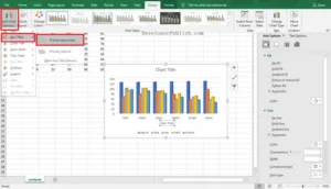
- Select Your Data: Highlight the cells containing the data you want to chart.
- Insert the Chart: Go to the “Insert” tab and choose your desired chart type from the “Charts” section.
- Customize and Refine: This is where the magic happens! Excel offers a plethora of options to personalize your graph:
- Axes and Labels: Edit titles, adjust scales, and add data labels for clarity.
- Series Formatting: Change colors, patterns, and line styles to differentiate data sets.
- Gridlines and Legends: Enhance readability and provide context.
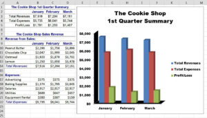
- Chart Title and Subtitle: Briefly summarize your key findings.
Part 3: Editing and Enhancing Your Graph
Once you have a basic chart, it’s time to refine it for maximum impact. And you will be needing the following features for that:
- Chart Elements: This helps to remove unnecessary elements like borders or shadows for a cleaner look.
- Data Table Integration: This includes a data table within the chart for quick reference to values.
- Error Bars: This show the variability of your data points for added credibility.
- Trendlines: This helps to identify potential trends and relationships within your data.
Remember: A well-designed graph should be clear, concise, and visually appealing. Don’t overload it with information, and ensure the colors and fonts are easy to read.
Part 4: Putting it all Together
The best way to master graph creation is through practice. Here are some ideas:
- Challenge yourself: Try creating different chart types for the same data set and compare their effectiveness.
- Analyze real-world data: Download datasets from online sources and practice visualizing trends and relationships.
- Get creative: Experiment with different formatting options and chart elements to find your own unique style.
By understanding the different chart types, mastering the creation process, and refining your editing skills, you’ll be well on your way to transforming your Excel calculations into compelling and insightful graphs. Remember, practice makes perfect, so keep exploring, experimenting, and expressing your data through the power of Excel charts!
We have come to the end of today’s class. I hope you enjoyed the class!
In the next class, we shall be discussing how to format spreadsheet graphs.
In case you require further assistance or have any questions, feel free to ask in the comment section below, and trust us to respond as soon as possible. Cheers!
Evaluation Time:
A company recorded the monthly sales of its three top products (A, B, and C) for the past year. You are provided with a spreadsheet containing this data.
(a) Create a line chart to visualize the sales trends for each product over the year.
(b) Explain the main insights you can draw from the chart about the performance of each product.
(c) Format the chart to improve its readability and visual appeal.
(d) Calculate the average monthly sales for each product and add a data table within the chart for quick reference. Good luck!