Back to: Computer Science JSS 3
Welcome to class!
In today’s class, we shall be talking about the practical excel calculations and formatting graphs. Please enjoy the class!
Practical Excel Calculation- Formatting Graphs
Excel is a powerful tool for crunching numbers and visualizing data, but mastering it requires both calculation skills and the ability to present your findings clearly. This class will equip you with the practical knowledge to manipulate data, perform essential calculations, and format stunning graphs that tell a compelling story.
1. Calculation Essentials:
Formulas: Understand the basics of Excel formulas, including cell references, operators (+, -, , /), and built-in functions like SUM, AVERAGE, and COUNT. Practice writing simple formulas to calculate totals, averages, and differences.
Functions: Dive deeper into powerful functions like VLOOKUP and INDEX MATCH for advanced data lookup and retrieval. Learn how to combine functions to create complex calculations that solve real-world problems.
Conditional Formatting: Apply conditional formatting to highlight specific data points based on criteria, such as exceeding a certain value or falling within a range. This makes your data easier to scan and identify trends.
2. Formatting Fundamentals:
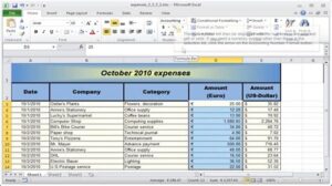
Cell Formatting: Change cell formats to display numbers as currency, percentages, dates, or custom formats. Apply borders, shading, and alignment to improve readability and organization.
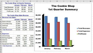
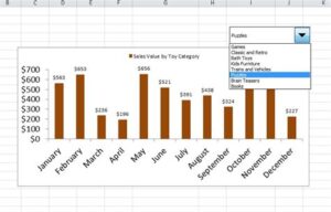
Chart Types: Choose the right chart type for your data. Learn about bar charts, line charts, pie charts, scatter plots, and more, each suited to showcase different relationships and trends.
Chart Elements: Customize your charts by adding titles, labels, legends, data series, and gridlines. Enhance clarity and understanding by adjusting font sizes, colors, and styles.
3. Formatting Tips and Tricks:
Chart Styles: Apply predefined chart styles to achieve a professional and consistent look. Experiment with different styles to find one that best suits your data and audience.
Sparklines: Embed tiny charts directly within cells to visualize trends without taking up extra space. Use sparklines to compare data across rows or columns at a glance.
PivotTables: Summarize and analyze large datasets by creating pivot tables. Group, filter, and sort data to identify patterns and insights that might be hidden within raw numbers.
4. Putting it All Together:
Case Studies: Apply your newfound skills to practical scenarios. Work through case studies where you calculate, format, and present data to solve real-world problems in finance, marketing, or any other field.
Best Practices: Learn best practices for effective data visualization. Consider color choices, chart size, placement, and data storytelling techniques to ensure your graphs communicate your message clearly and concisely.
Remember: Practice makes perfect. The more you practice formulas, formatting, and graph creation, the more comfortable and confident you’ll become.
Don’t be afraid to try new things and see what works best for your data. Excel offers a vast array of features to unleash your creativity.
Utilize online resources, tutorials, and communities to find answers to your questions and learn from others.
By mastering these practical Excel skills, you’ll transform your data into insightful visuals, empowering you to make informed decisions and communicate your findings effectively.
We have come to the end of today’s class. I hope you enjoyed the class!
In case you require further assistance or have any questions, feel free to ask in the comment section below, and trust us to respond as soon as possible. Cheers!
Question Time:
Charts and Visualization:
You are given a dataset showing the daily COVID-19 cases in your country for the past month. Use Excel to create:
- A line chart to visualize the trend of daily cases over time.
- A bar chart comparing the total cases in each week.
- A pie chart depicting the distribution of cases across different age groups.