Back to: MATHEMATICS JSS 2
Welcome to Class !!
We are eager to have you join us !!
In today’s Mathematics class, We will be looking at the Pictogram, Bar Chart and Pie Charts. We hope you enjoy the class!
CONTENT:
i) The Pictogram
ii) The bar chart
iii) The pie charts
INTRODUCTION
A frequency table is a numerical presentation of data in an organized summary from. Diagrams, symbols and pictures sometimes catch the eye more quickly than the number. They also tell stories more easily than numbers. It is also observed that it is easier to understand a frequency table than the raw data. Another method of presenting data, which most graphical than a table are Graphs. Graphs help us to observe any patterns easily. Examples of these graphs are pictogram, bar chart, line graph and pie chart.
THE PICTOGRAM
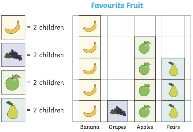
This uses pictures to represent statistics information or data. The pictogram is also called an ideograph. A pictogram uses pictures or drawings to give a quick and easy meaning to statistical data. A pictogram is a simple way of representing data in which a number of identical drawings or pictures and used to show the data. It is useful to use pictures which can easily be divided into halves, quarters and do on. A pictogram must have a key to show that each picture stands for. Also, you need to give the diagram a title
Example: The following table shows the favourite fruits of 75 students
Represent the data in the form of a pictogram.
Favourite sports Frequency
Banana 10
Apples 8
Pears 6
Grapes 2
Evaluation Question
The following table shows the number of students in JSS 1 in different houses at a certain school.
Represent the data in the form of a pictogram
| House | Blue | Yellow | Green | Purple |
| Students | 16 | 14 | 11 | 21 |
Reading Assignment
- Essential mathematics for JSS 1 by AJS Oluwasanmi page 187
- New general mathematics for JSS 1 by AJS Channon other. Page 125
- MAN mathematics for JSS 1 page 211
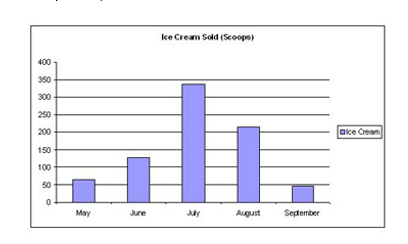
THE BAR CHARTS
A bar chart is very like a pictogram. The bars have the same width and usually have equal spaces between them. Instead of using pictures as in case of the pictogram, we must use a bar to represent the frequency of each of the item. In drawing a bar chart, we must take the following features into consideration.
- The charts consist of bars
- The bars must be of equal width
- The lengths of the bars are in proportion to the frequencies being represented. The bars may be vertical or horizontal
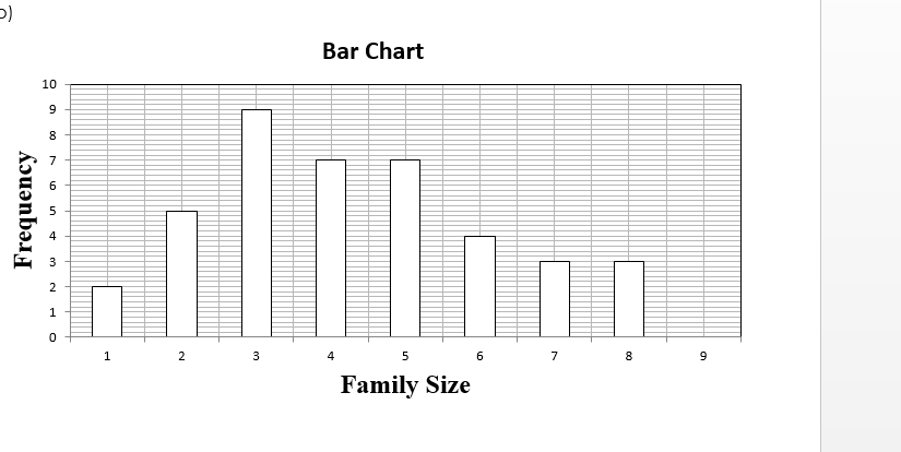
Example
The following figures show the number of children per family in a sample of 40 households
1, 2, 4, 3, 4, 3, 8, 3, 2, 2, 3, 2, 5, 6,
5, 4, 2, 1, 3, 2, 4, 5, 3, 8, 7, 6, 5,
4, 5, 7, 6, 3, 8, 6, 3, 5, 7, 5, 4, 3
- Prepare a frequency table for this data
- Draw a bar chart to illustrate the above data
Solution
- Frequency table
| No of children per family | 1 | 2 | 3 | 4 | 5 | 6 | 7 | 8 |
| frequency | 2 | 5 | 9 | 7 | 7 | 4 | 3 | 3 |
(b)
Evaluation Question
The table below shows the different colours of cars found in a company’s car park. Draw a bar chart for this data.
| Colour of cars | White | Blue | Red | Grey | black |
| Frequency | 20 | 17 | 10 | 8 | 15 |
Reading Assignment
Essential Mathematics for JSS 2 by AJS Oluwasanmi page 188
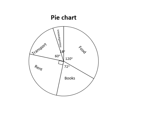
THE PIE CHART
A pie chart is a circle, which is divided into slices (i.e. sectors) whose angles are used to display data.
The size of an angle of each sector gives the frequency of each value. The major advantage of a pie chart is that it enables us to see clearly how the size of parts are compared in relation to one another and to the overall total. It is important to label each sector according to the given items and also give the pie chart a title.
Example: A student was given N600.00 in June as pocket money. He spent the money as follows:
Food = N200.00
Transport = N100.00
Books = N120.00
Rent = N150.00
Miscellaneous= N30.00
Draw a pie chart to illustrate the data.
Solution
There are 360o in a full circle and the total amount spent was N600.00 this means N600.00 is represented by 360o; N1 is represented by = 0.6
= 200 x 0.6
= 120o
| Items | Amount Spent in Naira (N) | Angle |
| Food | 200 | 200 x 0.6 = 120o |
| Transport | 100 | 100 x 0.6 = 60o |
| Books | 120 | 120 x 0.6 = 72o |
| Rent | 150 | 150 x 0.6 = 90o |
| Miscellaneous | 30 | 30 x 0.6 = 18o |
| TOTAL | 600 | 360o |
120o + 60o + 72o + 90o + 18o = 360o
GENERAL EVALUATION QUESTION
400 students were asked whether they liked yam, cornflakes, bread, rice or some other type of food for breakfast, the following data was recorded.
| Type of Food | Yam | Cornflakes | Bread | Rice | Other | Total |
| Frequency | 65 | 110 | 80 | 120 | 25 | 400 |
Draw a bar and a pie chart to represent this information
READING ASSIGNMENT
Essential Mathematics Bk. 2 pages 303 – 307. Exercise 24.2 No 1 and page 304
WEEKEND ASSIGNMENT
- Which of the following is not a pictorial form of presenting data?
- Bar chart B. Pie chart C. Frequency distribution D. Line graph
The pie chart below shows the course which a group of students are doing. Use the pie chart to answer questions 2 to 5
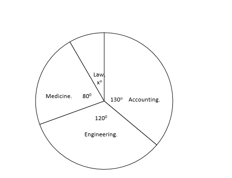
- What is the value of angle xo? A. 20o B. 30o C. 40o D. 35o
- Which course are most students doing? A. Engineering B. Accounting C. Law D. Medicine
- Which course has the least number of students? A. Engineering B. Accounting C. Law D. Medicine
- What fraction of the students are doing Engineering?
THEORY
- 40 youths who were admitted into a mental hospital due to drug abuse were asked to name the types of drugs they often take. The table shows how they replied.
Indian hemp 35%
Morphine 20%
Heroine 15%
Cocaine 30%
-
- Represent this information in a pie chart
- Find the number of youths in each category
We have come to the end of this class. We do hope you enjoyed the class?
Should you have any further question, feel free to ask in the comment section below and trust us to respond as soon as possible.
In our next class, we will be talking about Probability. We are very much eager to meet you there.