Back to: MATHEMATICS JSS3
Welcome to Class !!
We are eager to have you join us !!
In today’s Mathematics class, We will be talking about Statistics. We hope you enjoy the class!
Types of Presentation
A good presentation can make statistical data easy to read, understand and interpret. Therefore it is important to present data clearly.
- There are two main ways of presenting data: presentation of numbers or values in lists and tables;
- A presentation using graphs, i.e. pictures. We use the following examples to show various kinds of presentation.
| An English teacher gave an essay to 15 students. |
She graded the essays from A (very good), through B, C.D, E to f (very poor). The grades of the students were:
B, C, A, B, A, D, F, E, C, C, A, B, B, E, B
Lists and tables
Rank and order list
Rank order means in order from highest to lowest. The 15 grades are given in rank order below:
A, A, A, B, B, B, B, C, C, C, E, E, F
Notice that all the grades are put in the list even though most of them appear more than once. The ordered list makes it easier to find the following: the highest and lowest grades; the number of students who got each grade; the most common grade; the number of students above and below each grade; and so on.
Frequency table
Frequency means the number of times something happens. For example, three students got grade A.
The frequency of grade A is three. A frequency table gives the frequency of each grade.
| Grade | A | B | C | D | E | F |
| frequency | 3 | 5 | 3 | 1 | 2 | 1 |
Graphical presentation
In most cases, a picture will show the meaning of statistical data more clearly than a list of or table or numbers. The following methods of presentation give the data of the example in a picture, or graph form.
Pictogram
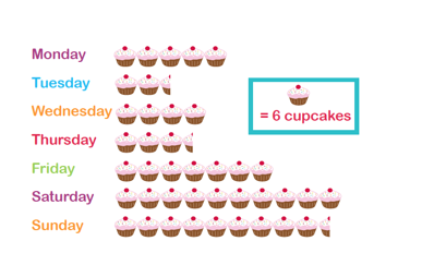
A pictogram uses pictures or drawings to give a quick and easy meaning to statistical data.
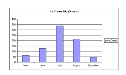
Bar chart
A bar chart represents the data as horizontal or vertical bars. The length of each bar is proportional to the amount that it represents.
There are 3 main types of bar charts.
Horizontal bar charts, vertical bar chart and double bar charts.
When constructing a bar chart it is important to choose a suitable scale to represent the frequency.
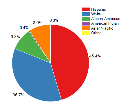
Pie Chart
Pie charts are useful to compare different parts of a whole amount. They are often used to present financial information. E.g. A Company’s expenditure can be shown to be the sum of its parts including different expense categories such as salaries, borrowing interest, taxation and general running costs (i.e. rent, electricity, heating etc.).
A pie chart is a circular chart in which the circle is divided into sectors. Each sector visually represents an item in a data set to match the amount of the item as a percentage or fraction of the total data set.
Example
A family’s weekly expenditure on its house mortgage, food and fuel are as follows:
| Expenses | N |
| Mortgage | 300 |
| Food | 225 |
| Fuel | 75 |
Draw a pie chart to display the information.
Solution
The total weekly expenditure = N300 + N225 + N75 = N600
We can find what percentage of the total expenditure each item equals.
Percentage of weekly expenditure on:
Mortgage = X 100% = 50%
Food = X 100% = 37.5%
Fuel = X 100% = 12.5%
To draw a pie chart, divide the circle into 100 percentage parts. Then allocate the number of percentage parts required for each item.
Note
It is simple to read a pie chart. Just look at the required sector representing an item (or category) and read off the value. For example, the weekly expenditure of the family on food is 37.5% of the total expenditure measured.
A pie chart is used to compare the different parts that make up a whole amount.
EVALUATION
The following is a rank order list of an exam result: 87, 82, 78, 76, 75, 70, 66, 64, 59, 59, 59, 51, 49, 48, 41.
- How many students took the exam?
- What was the highest rank?
- What was the lowest rank?
- What is the mark of the student who came 6th?
- What is the position of the student who got 76 marks?
- Three students got 59 marks. What is their position?
- How many students got less than 75 marks?
We have come to the end of this class. We do hope you enjoyed the class?
Should you have any further question, feel free to ask in the comment section below and trust us to respond as soon as possible.
In our next class, we will be talking about Factorization involving Common Factors. We are very much eager to meet you there.