Back to: COMPUTER SCIENCE JSS3
Welcome to Class !!
We are eager to have you join us !!
In today’s Computer Science class, We will be discussing Creating and Editing Graphs. We hope you enjoy the class!
TOPIC: CREATING AND EDITING GRAPHS
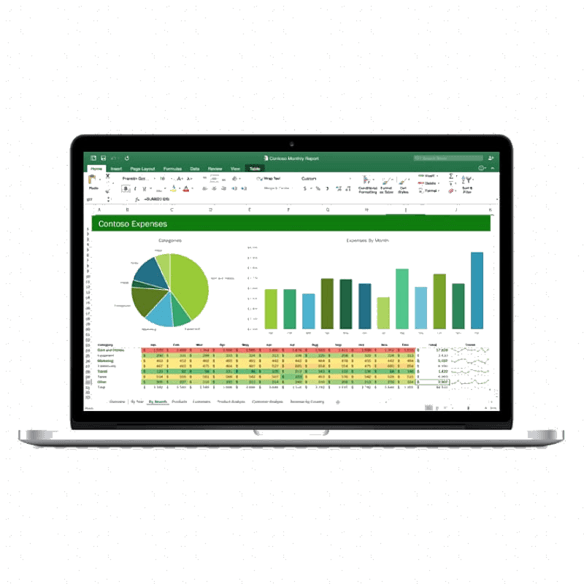
Charts are used to display a series of numeric data in a graphical format to make it easier to understand large quantities of data and the relationship between different series of data.
To create a chart in Excel, you start by entering the numeric data for the chart on a worksheet. Then you can plot that data into a chart by selecting the chart type that you want to use on the Insert tab, in the Charts group.
- Worksheet data
- Chart created from worksheet data
Excel supports many types of charts to help you display data in ways that are meaningful to your audience. When you create a chart or change an existing chart, you can select from a variety of chart types (such as a column chart or a pie chart) and their subtypes (such as a stacked column chart or a pie in the 3-D chart). You can also create a combination chart by using more than one chart type in your chart.
Example of a combination chart that uses a column and line chart type.
Get to know chart elements
A chart has many elements. Some of these elements are displayed by default, others can be added as needed. You can change the display of the chart elements by moving them to other locations in the chart, resizing them, or by changing the format. You can also remove chart elements that you do not want to display.
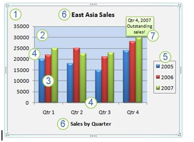
- The chart area of the chart.
- The plot area of the chart.
- The data points of the data series that are plotted in the chart.
- The horizontal (category) and vertical (value) axis along which the data is plotted in the chart.
- The legend of the chart.
- A chart and axis title that you can use in the chart.
- A data label that you can use to identify the details of a data point in a data series.
Modify a basic chart to meet your needs
After you create a chart, you can modify any one of its elements. For example, you might want to change the way that axes are displayed, add a chart title, move or hide the legend, or display additional chart elements. To modify a chart, you can do one or more of the following:
- Change the display of chart axes You can specify the scale of axes and adjust the interval between the values or categories that are displayed. To make your chart easier to read, you can also add tick marks to an axis, and specify the interval at which they will appear.
- Add titles and data labels to a chart: To help clarify the information that appears in your chart, you can add a chart title, axis titles, and data labels.
- Add a legend or data table You can show or hide a legend, change its location, or modify the legend entries. In some charts, you can also show a data table that displays the legend keys and the values that are presented in the chart.
- Apply special options for each chart type Special lines (such as high-low lines and trend lines), bars (such as up-down bars and error bars), data markers, and other options are available for different chart types.
Apply a predefined chart layout and style for a professional look
Instead of manually adding or changing chart elements or formatting the chart, you can quickly apply a predefined chart layout and chart style to your chart. Excel provides a variety of useful predefined layouts and styles. However, you can fine-tune a layout or style as needed by making manual changes to the layout and format of individual chart elements, such as the chart area, plot area, data series, or legend of the chart. When you apply a predefined chart layout, a specific set of chart elements (such as titles, a legend, a data table, or data labels) are displayed in a specific arrangement in your chart. You can select from a variety of layouts that are provided for each chart type. When you apply a predefined chart style, the chart is formatted based on the document theme that you have applied, so that your chart matches your organization’s or your own theme colours (a set of colours), theme fonts (a set of heading and body text fonts), and theme effects (a set of lines and fill effects).
You cannot create your own chart layouts or styles, but you can create chart templates that include the chart layout and formatting that you want.
Add eye-catching formatting to a chart
In addition to applying a predefined chart style, you can easily apply formatting to individual chart elements such as data markers, the chart area, the plot area, and the numbers and text in titles and labels to give your chart a custom, eye-catching look. You can apply specific shape styles and WordArt styles, and you can also format the shapes and text of chart elements manually. To add formatting, you can use one or more of the following:
- Fill chart elements: You can use colours, textures, pictures, and gradient fills to help draw attention to specific chart elements.
- Change the outline of chart elements: You can use colours, line styles, and line weights to emphasize chart elements.
- Add special effects to chart elements: You can apply special effects, such as shadow, reflection, glow, soft edges, bevel, and 3-D rotation to chart element shapes, which gives your chart a finished look.
- Format text and numbers: You can format text and numbers in titles, labels, and text boxes on a chart as you would text and numbers on a worksheet. To make text and numbers stand out, you can even apply Word Art styles.
Reuse charts by creating chart templates
If you want to reuse a chart that you customized to meet your needs, you can save that chart as a chart template (*.crtx) in the chart templates folder. When you create a chart, you can then apply the chart template just as you would any other built-in chart type. In fact, chart templates are custom chart types — you can also use them to change the chart type of an existing chart. If you use a specific chart template frequently, you can save it as the default chart type.
EVALUATION
- State the steps to modify a chart
WEEKEND ASSIGNMENT
- ___ is a collection of cells organized into rows and columns where data is stored and manipulated. Worksheet B. Graph C. Workbook D. Active cell
- ___ is a space in a worksheet formed by the intersection of a row and a column. A. Workbook B. Sheet C. Cell D. Cell Reference.
- There are ……… rows per worksheet in Excel. A. 1,048,576 B. 1,048,765 C. 1,408,576 D. 1,022,333
- There are ___ columns per worksheet in Excel. A. 16,387 B. 16,384 C. 16,684 D.15,341
- The address of a cell is known as ___ A. Cell space B. Cell reference C. Cell Menu D. Active cell
We have come to the end of this class. We do hope you enjoyed the class?
Should you have any further question, feel free to ask in the comment section below and trust us to respond as soon as possible.
In our next class, we will be talking about Hacking. We are very much eager to meet you there.